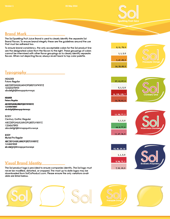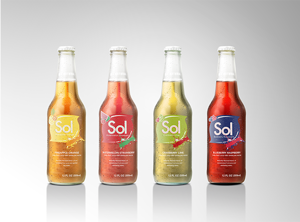


The company provided all natural carbonated fruit drinks, so it required a name and logo that was bright and warm like outside in a fruit garden. The name Sol was proposed as it means sun and the logo was developed to represent the sun. The original logo was designed to be very bright.
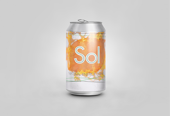
While rebranding the product I took it in two different directions. I started with developing the all-natural fruit drink into an energy drink, developing the logo with flames to have more action, a natural feel, and also utilized the sun logo as I wanted the brand to still be recognized by customers.
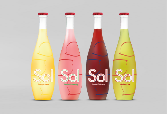
I also decided to take the original product and rebrand it to a different demographic. The brand was marketed toward the party girl and made available as an alternative to drinking alcohol or also as a drink mixer. The logo utilized the original sun shape but simplified it, making it more modern.
